Measuring Success in MOOCs (or More Specifically, DALMOOC)

I was asked last week how we knew whether or not DALMOOC was successful. Seems a fair question since “success” in MOOCs seems to be measured by everything from completion rates to enrollment numbers to certificate numbers to alignment of the stars on the Wednesday of the first week the MOOC is offered. I had to be honest about that question and say that since everyone that work on DALMOOC lived and are still on speaking terms (at least as far as I know), then we were successful. Running a MOOC can be far more intensive and stressful than many people realize. We almost didn’t make it out the other side with everyone still happy.

In some ways, when I see people saying that we were blending xMOOCs and cMOOCs, or combining the two, I think we might have failed in the communication of what we were doing. Maybe I can blame that somewhat on our current educational system that only thinks in linear ways; therefore any course with more than one layer is not scene as complex, but “blended” or “combined.” Words like “straddled” seem closer, but to be honest we didn’t feel the need to straddle. We just had two layers that were not walled in, allowing learners to choose one or the other or both or to move back and forth as they felt. Infinite possibilities. A Multiverse Open Online Course maybe even. But not really a linear mix of the two from the design side.

Of course, the learner experience was linear even if they skipping back and forth between both layers. So maybe when the participants use words like “blended” or “straddled” or “combined,” those statements in themselves are actually signs of success. In the beginning, some claimed that DALMOOC was more cMOOC than xMOOC, but by the end others were claiming it was more xMOOC than cMOOC. Maybe all of these various, different views of the course are proof that the original design intention of truly self-determined learning was realized. At the very least, DALMOOC feedback was an interesting study in how bias and ontologies and epistemologies and all those -ologies affect participant perception of design. Maybe it doesn’t matter than participants can’t articulate the basics of dual layer architecture because the point all along should have been to hide the architecture and let learners learn how to learn.

So, at the end of the day, I will be able to come up with some philosophical jargon to “prove” that DALMOOC was a success to the powers-that-be who ask – all of which will be true. But to be honest, the only thing I really want to do is shrug my shoulders and say “beats me – go look the participant output itself and see if that looks like success to you.”

Looks like success to me.

DALMOOC Design and Scaffolding

Returning again to the design of DALMOOC and more specifically the visual syllabus, I wanted to take a look at the scaffolding decisions that were made. In some ways, this course was a unique challenge because we had to do some true scaffolding that could possible span several different levels of experience, from complete newbie to seasoned expert. This is different than most instances of scaffolding, because typically college curses are really more along the lines of linear constructivism than scaffolding. What I mean is this: for most courses on the college level, you assume that your learners have a prerequisite level of knowledge from either high school or earlier pre-req courses. You aren’t introducing, say, physics for the first time ever – but instead you are building on the Intro to Physics course in order to help students learn how to build rockets and predict launch patterns. So you don’t scaffold as much as take chunks of knowledge and skills and plug them into (linear constructivism) existing knowledge. This is scaffolding at the basic level, but you may or may not go beyond one level of scaffolding.

With DALMOOC, we knew that learning analytics is still new for many, but old news for some that may just want to learn some different tools. Additionally, we were adding in new technology that we knew for a fact that no one had ever used. Throw in that mix an international crowd that won’t all be speaking English and then even add the idea to create a visual syllabus (which few are familiar with). This is a tall order covering a huge range that most courses don’t have to consider.

So where to start? Well, with the first page of the syllabus. It needed to be visual, with minimal text, but clear where to start. A wall of text that basically says “start here” kind of violates a lot of what it needed to be. But if you look at anything from OLC to Quality Matters, most online course evaluation tools recommend having a clear and simple indication of where to start. What is more simple and easy to understand than a basic “1, 2, 3, etc”? I have traveled to Asia and Europe and Africa and even people who don’t know English still understand enough about our number system to know that a web page with those numbers on them would indicate you start with number 1.

Of course, a small number of people felt that this was still too confusing. I’m not sure what to say to that. You are presented with a page that says “Welcome to the Class” and then some big buttons that are labeled 1, 2, 3, etc. I’m not sure what is simpler than that.

Of course, I realize that there are those that really, really need the text because they have been programmed to look for it their whole lives. The buttons were given a rollover effect that gives a more detailed description of what they are leading to. This serves two purposes. One, it gives detailed descriptions that are there when you need them, but aren’t filling the screen and overwhelming people that are completely new. Two, they make you actually do something with the syllabus instead of just passively reading a wall of text. You have to mouse over or click on various items to get more details. This moves you from passive to (slightly) active. This was on purpose to get learners engaging more with the content on the very first page. Additionally, this idea was continued on the other various visuals.

For those that are not new to all of this, links were provided on the upper right hand corner – where they usually are on most websites. We don’t expect people to follow the path laid out for them. In fact, we encouraged learners to skip around and make their own path as needed. And that was also possible from the design.

As expected, there was some push back from a few learners (about 5-10 out of the 6,000 that were active at some point) on the design. The basic feedback was that they didn’t like the roll over effects. They wanted the text to be there without rolling over. This probably tells me that the right decision was made, because that was exactly what the rollover effects were designed to do: make the learner do something instead of passively absorbing text. Of course, there are other ways to accomplish the same goal, so other ideas might be used in the future.

The biggest challenge in describing the structure was how to explain the nature of the dual layer course. Course themes are always helpful, as the many versions of ds106 have proven. Of course, it would have been nice to have enough time to have carried out the theme for the whole class. Many of the problems with understanding the structure can probably be traced to the fact that we were not able to inject this theme throughout the entire course (of course, those problems could also come from the fact that we initially designed the daily email to be the central anchor for the course (and therefore, the place were scaffolding and structure sense-making would happen)). It seems like that aspect fell short. However, I think that a consistent theme that is carried throughout the course as a true sensemaking/guidance tool would alleviate many of these issues. Of course, scaffolding in general is a problematic concept in this dual layer approach, but that will have to be a topic for another blog post.

The theme itself was chosen early as an initial idea that ended up sticking. I think the Matrix “blue pill/red pill” theme was a good place to start, but gets a little murky once people start mixing the two and bringing in their own ideas (which is, of course, what we want). My first idea was actually a table full of play-dough – all kinds of colors just waiting for learners to pick and choose and make into whatever they like. Ultimately, this leaned too much towards my connectivism bias and was probably too unstructured for new learners who wanted instructivism. I think that a mixture of the two ideas might work as a better theme in the future: learners are initially given the choice of blue or red play-dough, but they can choose one or the other or mix together to make their own shade of purple – or bring in their own colors to create what they want.

Of course, some of the more complex ideas that were thrown around earlier, like creating scaffolding out of objectives or dynamic group formation and changing, never made it into the course. Interestingly enough, some learners (around 10-15) asked for various versions of these ideas, so they may bear exploration in the future.

Underlying these design decisions were some different theoretical perspectives that go beyond Connectivism and Instructivism (LTCA Theory, Heutagogy, Metamodernism, etc) that will need to be explored in a future blog post.

Who MOOCed My Cheese?

Conversations behind the scenes with the DALMOOC have turned to looking at the kind of feedback we have been getting on the course. George Siemens shared some of the things that he learned the first week. His post also deals with some of the feedback we have received.

The hard part with dealing with feedback is that most of us end up with a skewed view of it after a while. Positive feedback is usually pretty general and therefore easy to forget because its not very specific. Everything from “this looks great!” to “I am loving this!” to “I really like what you are doing here” serves as great feedback, but because of the general nature and lack of specifics tend to be easily forgotten. Negative feedback tends to be specific and direct. This makes it a lot easier to remember. People will tell you exactly what they don’t like and a dozen reasons why they don’t like it.

Because of this skew, the negative feedback tends to stick in our mind more easily and we also tend to get the impression that there is more negative than positive. This becomes a problem when we begin to make design decisions based on gut feelings rather than hard numbers. If you count up the positive and negative feedback, which one is higher? If you take a qualitative look at what was said, is there anything helpful either way? Saying “I love this” really just indicates a personal preference more than an actual analysis that a designer should take into consideration. In the same way, “I don’t like this” is also really just a personal preference that really doesn’t tell us much about design. Learning is not all puppy dogs and fairy tales – sometimes you have to create situations where learners have to choose to stretch and grow in order to learn. There is nothing wrong with some struggle in learning. Often, complaints about learners not liking something are actually good indicators that your design is successful.

If you disagree, that is fine. But don’t design anything that involves group work. A lot of people hate group work and if you create a lesson that requires group work, you have just acknowledged that sometimes you have to struggle through group dynamics in order to learn whether you like it or not :)

But sometimes when someone says “I don’t know what to do with this tool!” what they are really saying is “I am not sure what to do and I don’t want to try because in the past there have been huge penalties for trying and getting it wrong on the first try!” This is a sad indication of our educational systems in general. We don’t make it okay to experiment, fail, and learn from failure.  The reason so many people demand more tutorials, more hand-holding, more guidance is not because they afraid of chaos as much as they are afraid that they will get their hand slapped for not getting it right the first time. This is likely due to it almost always happening in the past.

So in something like DALMOOC, where you are free to get in and experiment and fail as much as you want to, most of us have been conditioned to panic in that kind of scenario. That’s what our excessive focus on instructivism does to us as a society. People are afraid to play around and possibly fail for a while. They want to know the one right way to do something, with 10 easy steps for doing it right the first time.

So, in a lot of ways, much of the feedback we are getting is along the lines of “who moved my cheese?” And that was expected. We are trying to jump in and explain things to those who are confused as much as possible. We are hoping that those who are bringing up personal preferences as negatives will see that we had to design for the widest range of learners. Or maybe to see that if they still figured something out, that this thing actually worked as designed (because its not always about personal preferences as much as learning).

But, to be quite honest, an objective examination of all feedback would seem to indicate that most of it is positive. Many of you like the challenges and the struggles. That is great – you get it. Most of the positive and negative feedback is along the lines of personal preferences – you don’t like rollover effects, you love Bazaar, this optional assignment is too hard, this required one is too easy. I’ll continue blogging on design decisions to clarify why they were made – not to justify them as right (instructional design is rarely about black and white, right and wrong decisions anyways), but to explain why they were made. And there are some genuine complaints about confusion that we are addressing.

Just as us instructors and designers can develop a negative skew, so can the learners. They can see a few specific negative tweets in a sea of general positive tweets and start to think “wow – maybe I should be having more problems?” Don’t worry – most people are doing just fine. Problems, praises, issues, suggestions, and complaints are welcome, but just remember they don’t necessarily apply to you as a learner. You are free to love or hate any part of the course you wish. You are also free to pick and choose the parts of the course you participate in, so don’t waste time with something that isn’t working for you. But also be careful not to label something as “not working for you” just because you don’t like it or are struggling with it. Sometimes the struggle is the exact thing that you need in order to learn.

MOOCs and Codes of Conduct

Even before the whole GamerGate thing blew up, I had been considering adding a Code of Conduct to the DALMOOC. UTA has always required an Honor Code in all course syllabuses, so to me this issue was a no-brainer (even though we aren’t treating DALMOOC as a specific UTA-only course). But I know others don’t see the need for Codes in general, so I wanted to dig more into the reasoning behind a Code of Conduct for online courses – especially MOOCs.

I know some feel that you can’t really stop bad people with just a statement, and that usually the community will rise up to get rid of the abusers and trolls anyways. Sometimes both of those are true. But not always.

I have been a part of Facebook groups that did not have a code and ended up leaving. You would think the group would have risen up to stop people from being abusive, but that was not the case. And when I spoke up? Well, it quickly became time to leave. I have also been in some groups that did have a code in them and witnessed first hand seeing someone asked to comply with the code and – believe it or not – they stopped, apologized, and changed. It does work sometimes.

But other times it doesn’t. So you can’t just say “be cool to everyone” and leave it at that. There has to be a threat of consequences from the people in charge for the Code to have teeth. The problem with using the UTA Honor Code in a MOOC was that it was designed for a small group of people in a closed system where you can ultimately with one click boot out people that don’t comply. And then send the police after them if they don’t get the message. Open online courses, though? A lot trickier to enforce.

So, I turned to the work of Ashe Dryden and her recommendations for conference codes of conduct. Since conferences are a bit more open than closed online courses, I thought that would be a good place to start. I also decided to add links to the privacy statements of all services we recommend, as well as links to reporting abuse on those services. I felt people needed to be aware of these issues, as well as know what one place to go to access the, all. If I should add anything else, please let me know.

So you might wonder why the language is so specific on the Code. Just tell people to be cool or else your out, right? The problem is that this is too vague. Some people can be very abusive in a way that flies under the radar of most gatekeepers, because they are looking for obvious hateful words and actions. True abusers have found ways to go under the radar. So we need to be as specific as possible in these codes as a way to empower our learning communities to know what to look for in the first place. You can’t just expect the community to rise up and fight abusers – you have to give them the tools and words to use in order to fight. And one of those tools needs to be an appeal to authority. You see, its one thing to say “I think you are being abusive, stop” and another to say “the rules say this: _____.” Trust me from experience: abusers rarely care when you come in and say “stop treating this person that way because I think you are wrong.” If we want our communities to rise up and stop abuse, we have to empower them with the tools and words they need from us as the leaders. Yes, they are able to come up with their own words; however, it is much more powerful when their words match ours instead of fill in our blanks.

And I know what many say: “this will never happen – I have never seen abuse happening in classes.” I hope that is true. But I would encourage you to look into recent cyber bullying research. Many people that experience abuse do not speak up because they feel no one will listen. So is the fact that you have never heard of abuse online a sign that there is none, or that no one thinks you are a safe person to discuss the issues with? An important difference there.

Think of it this way. The DALMOOC has over 18,000 people signed up last I heard. That is more people than thousands of small towns in America. Thousands of towns that also have a crime rate and an abuse rate. If even small towns can’t escape from attracting criminals and abusers, how sure are we that our MOOCs will?

And oh yeah: #stopgamergate. Call me a SJW or whatever you want. I wear it proudly.

Social Learning, Blending xMOOCs & cMOOCs, and Dual Layer MOOCs

For those who missed it, the Data, Analytics, and Learning MOOC (DALMOOC) kicked off orientation this week with two hang-outs – one as a course introduction and one as a discussion over course design. Also, the visual syllabus, the precursor of which you saw here in various blog posts, is now live. The main course kicks off on Monday – so brace yourselves for impact!

The orientation sessions generated some great discussion, as well as raised a few questions that I want to dive into here. The first question is one that came about from my initial blog posts (but continued into the orientation discussion), the second is related to the visual syllabus, and the third is in relation to the Hangout orientation sessions themselves:

  • Don’t most MOOCs blend elements of xMOOCs and cMOOCs together? The xMOOC/cMOOC distinction is too simple and DALMOOC is not really doing anything different.
  • Are the colors on the Tool flow chart mixed up? Blue is supposed to represent traditional instructivist instruction, but there are social tools in blue.
  • Isn’t it ironic to have a Google Hangout to discuss an interactive social learning course but not allow questions or interaction?

All great points, and I hope to explain a bit more behind the course design mindset that influenced these issues.

The first question goes back to the current debate over whether there are really any differences between xMOOCs or cMOOCs or whether this is a false binary (or not). I have blogged about that before, and continued by pointing out that the xMOOC/cMOOC distinction is not really about “binary” at all as much as where certain factors cluster (more specifically, power). I submitted a paper to AREA this year (that I hope gets accepted) with my major professor Dr. Lin that was basically a content analysis of the syllabuses from 30 MOOCs. I noticed that there were clusters of factors around xMOOCs and xMOOCs that didn’t really cluster in other ways. I am now working on some other studies that look at power issues and student factors like motivation and satisfaction. It seems like not matter what factor I look at, there still appears to be clusters around two basic concepts – xMOOCs and cMOOCs. But we will see if the research ends up supporting that.

So from my viewpoint (and I have no problem if you disagree – we still need research here), there are no hard fast lines between xMOOCs and cMOOCs. The real distinction between the xMOOCs and cMOOCs is where various forms of power (expert, institutional, oneself, etc) reside. For example, was any particular course designed around the students as source of expert power, or the instructor? You can have content in a course that has the student at the center. You can also have social tools in a course that sets the instructor as the center.

Our guiding principle with the DALMOOC was that there is nothing wrong with either instructivism / instructor-centered or connectivism / student-centered as long as the learner has the ability to choose which one they desire at any given moment.

That is also the key difference between our goal with course design and how most other blended xMOOC/cMOOCs are designed. Most blended MOOCs (bMOOCs? Sounds like something from the 80s) usually still have one option / one strand for learning. The content and the social aspects are part of the same strand that all learners are required to go through. Remember, just adding social elements to a course does not make it a social learning, student-centered, connectivist course (especially if you add 20 rules for the forum, 10 rules for blog entries, and then don’t allow other avenues beyond that). In the same manner, just adding some content or videos or one-way Hangout sessions does not make a cMOOC an instructor-centered, instructivist course.

Our design goal was to provide two distinct, separate layers that allow the learner to choose either one or the other, or both for the whole class, or mix the two in any manner they want. But the choice is up to the learner.

And to be clear, I don’t think there is anything wrong with blendedMOOCs. Some are brilliantly designed. Our goal with DALMOOC was just different from the blended approach.

So this goal led to the creation of a visual syllabus to help myself and others visualize how the course works. One comment that arose is that the colors on the tool flow page (explained here) are mixed up: the Quick Helper and Bazaar tools (explained here by George Siemens) are in blue and should be in red. I get that concern, but I think it goes back to my view of the distinction between xMOOCs and cMOOCs. The red color is not “social only” and the blue color is not “content only,” as some would classify the difference between cMOOCs and xMOOCs. The colors are about where the expert power lies. Quick Helper might have social aspects to it, but the main goal is to basically crowd-source course help when learners are trying to understand content or activities. And it is a really cool tool – I love both Quick Helper and Bazaar (and ProSolo, but the orientation Hangout for that one is coming up). But the focus of Quick Helper is to help learners understand the content and instructor-focused activities (again, nothing wrong with that since the choice is up to the learner to give that expert power to the instructor). In the same way, the Bazaar tool is social, but has a set of prompts that are written by the instructor for learners to follow.

I hope that clears that up a bit – the colors indicate where the expert power resides in the design – neither of which are bad in our design. Of course, you as the learner might use these tools differently than that and we are okay with that, too.

The third question is about the irony of using a Google Hangout to explain a student-centered course and then not allow any interaction. I kind of snickered at that one because I usually say the same thing at conference keynotes that talk about interactive learning but then don’t allow for interaction. So it sounds exactly like something I would say. Of course, at keynotes, you usually have the totality of the examination of that topic at that one keynote and then the speaker is gone. A course is different, obviously. But in explaining our reasoning for this issue I would point back to the differences between cMOOCs and xMOOCs and again bring up the point that being student-centered and connectivist does not mean that there are never any times of broadcast from the instructor. A 30 minute Hangout with no interaction fits into a student-centered mindset just fine as long as you don’t see hard fast lines between paradigms.

But I would also point out that the Google Hangout format is too limited for interaction at scale. You are only allowed 10 people in the actual Hang-out. In addition to that, going over 30 minutes gets a bit tedious, and you can’t really do much interaction with learners in 30 minutes even when using the Q&A feature. Not to mention that 30 minute window is set in stone – if a learner misses it because of work or different time zone or whatever: “no interaction for you!” Using a Google Hangout for a global course would be like being the ultimate “Interaction Nazi.” We also noticed a 30-60 second lag between live and broadcast, so that also hampers interaction. Howver, the biggest reason was that we were really looking at ProSolo, Twitter, our Facebook Page, and our Google+ Page as the true avenues for interaction with these Hangouts. Those avenues were active before, during, and after the Hangout for people in any time zone. So the interactivity was there during the orientation sessions, and you actually did see us responding to things from the social channels in both Hangouts. This may change in future Hangouts. The instructors may open up the Q&A function of Hangout. We’ll see.

So, if you have questions about DALMOOC content or design, be sure to post them to social avenues. Or comment here about this post. I am behind on comments (and blogging) due to the looming course launch, but I will get caught up :)

Visual Flow of Learner Tools in the Dual Layer MOOC

As we get closer to the launch of the Data, Analytics, and Learning MOOC, one of the ideas we are trying to bring to life is a Visual Syllabus. The instructors expressed concern with the “wall of text” that many learners run smack into when reading a syllabus. That is a very valid concern, so the idea was born to make the syllabus more visual and narrative.

Below is the rough draft of the flow of learner tools that will be used in the course. The idea is that learners will be able to click on each area and get an in-browser pop-up with a brief description of each along with a link to start using the tool. I would love to be able to put together an animated gif of this (time permitting).

dalmooc-tool-flow

Two quick notes: this is for the learner tools, the tools that the learners will use while learning, as compared to the analytics tools they will be learning about (Tableau, RapidMiner, etc). Secondly, the random pill images are connecting a metaphor that I am thinking about weaving throughout the syllabus (based on choosing the red pill or blue pill in The Matrix; except both represent reality, just one learners are used to and the other that they aren’t). Everything here is subject to change, including the dualistic metaphor.

The general idea is that all learners will get a kick off email for the week, setting out the main idea for that week. Learners will then choose to go down the blue path (towards an instructivist path they are accustomed to) or the red path (towards a connectivist path they may not be accustomed to).

Those on the blue path will enter the EdX course content to view videos, read text, perform activities, etc. As they encounter issues or concepts they need help with, there will be in-context help buttons to click on to get customized help (but still cooler than that, I am just being vague because this will be new tech that is still being worked on). They will also be put in groups of 3-5 by a new technology to work on specific problem-based learning activities (again, new tech that will be detailed later, but trust me its cool). Some of the course work will be highlighted in daily email updates. Learners can repeat parts as needed or even cross over to the red path at any point they wish.

Those on the red path will enter ProSolo (embededd in EdX). This is a new suite of technology that basically enables learners to set their own goals, connect with others that have similar goals, and work to create proof that they have met those goals. If you remember many of the calls to create a tool that fosters true Personal Learning Networks, this is basically that tool. ProSolo will be used in this course and is another cool new thing we are trying. More details on that one to be announced soon. The learners will then go to the Problem Bank (or whatever we name our installation of the ds106 Assignment Bank tool) to find and / or submit problem ideas to work on. They would then connect with their PLN (Internet on the diagram) and work on the problems. Then they would submit artifacts back to the bank. Their blogs, tweets, videos, and other various artifacts will be collected for the daily email updates. Learners can repeat parts as needed or even cross over to the blue path at any point they wish.

The learners will repeat, crossover, and work on various activities until the week is over or they are finished and then repeat for the next week.

All of this is just the rough draft. If you are interested in seeing how it all works out, I would recommend at least lurking in the upcoming #dalmooc :)

Symphony or Cacophony? Cracking the Code of Tool Selection in MOOCs

One of the bigger struggles with modern day education is tool selection. There are so many good tools that do such similar things that everyone from instructors to CIOs are trying to figure out the secret formula for how many are too few to offer and how many are too many to manage. Some schools apply the “all your eggs in one basket” approach, forcing everything into one mega tool like Blackboard. Others advocate no restrictions, so that learners will be faced with so many tools that they get lost and confused.

Having all your eggs in one basket is nice from a bottom line perspective, but not very realistic for the world we live in since one instrument virtuoso are less in demand. However, Putting too many options in one course can overwhelm everyone from the instructor to the students to the support staff to, well… everyone with a hand in the game. A balance needs to be struck so that your diverse collection of instruments works together as a symphony but avoids the chaos of cacophony.

As we are looking at the dual layer MOOC design, the number of tools we would like to use is also ballooning. Some have been around for a while, some are newer, others are being tested out in this course. But they all seem to play a vital role, so how do we get the right amount that doesn’t overwhelm the students, but still gives them freedom to use what is most meaningful to them?

We could easily just say that all students will use Tableau, WordPress, and EdX for everything…. but that may not end up being what they will use after the class if over, and therefore end up rather useless to them.

We could also just as easily list a ton of tools and link to tutorials, but that would overwhelm many students and encourage more to drop out.

The solution is probably somewhere in the middle – where we offer enough tools to get everything accomplished in the course (assuring, of course, that we are focusing on teaching how to accomplish certain tasks over just focusing on the software) while helping learners to focus in on the tools they need at that given moment.

This is where Nicolas Cage and National Treasure comes in. Cage’s character is trying to use multiple tools to crack a code to find a treasure, basically. But in one scene there are so many possibilities out there that the clue seemed like useless blabber. Fast forward a few scenes and Cage’s figures out that the pair of older glasses would change what he saw on the piece of paper as he changed lenses:

Glasses1

Learners in the multiple pathways/dual layer MOOC will be changing technology filters as they go through the course to accomplish different tasks. There will be many more “lenses” than in the glasses pictured above, each one helping them see a different aspect of learning analytics. Our mission is to organize and tie the various technology filters together in a seamless fashion.

It would almost be nice if we could embed an UrbanSpoon slot-machine like app into the weekly/daily email communication. Learners select the layer they are in (xMOOC or cMOOC), the analytics tool for the week (Tableau, Gephi, RapidMiner, or LightSIDE), and the activity they are working on and they get a custom set of instructions for the week.

MOOC Spoon

Probably a bit beyond what we have time for, but our design will need to help learners focus on just the tools that they need for the time being.

In a general sense, the weekly flow of tools could look something like this:

dual-mooc-tools

Learners would receive the weekly update which guides them to the tools they need to focus on (even though all tools can be used as secondary if needed). The learners then use these tools to go through the zone of proximal development (ZPD) surrounding the weekly main concept. The learning analytics tools are a part of the support for traversing the ZPD. Data collection tools will collect data to guide the next weekly email, as well as student work to highlight in the same email. These weekly (or maybe even daily) communication pieces are important in keeping students in different pathways aware of everything that is happening across the class, and will hopefully even draw some into trying different pathways.

Of course, this is a simplistic look at the process. Or maybe more of a road map for design. The time consuming part will be in building a unified user experience. I’m a fan of the way ds106 created a handbook for this purpose – kind of a combination how-to and FAQ space complete with quick start guide even. They cracked the code for turning their particularly large set of lenses / tools into a symphony quite nicely, and hopefully we can do the same.

(Note: ProSolo is a toll in development that, for lack of better words, serves as a place to collect various streams of content that learners create in their own space. I have been watching the developments with Known that Jim Groom has blogged about, and I like where they are going with that. ProSolo seems to have some similarities with Known on the hub side of things. I’m not sure whether it will receive input from a POSSE (Publish (on your) Own Site, Syndicate Elsewhere) service.)

Theoretical Flow of Heutagogy in MOOCs

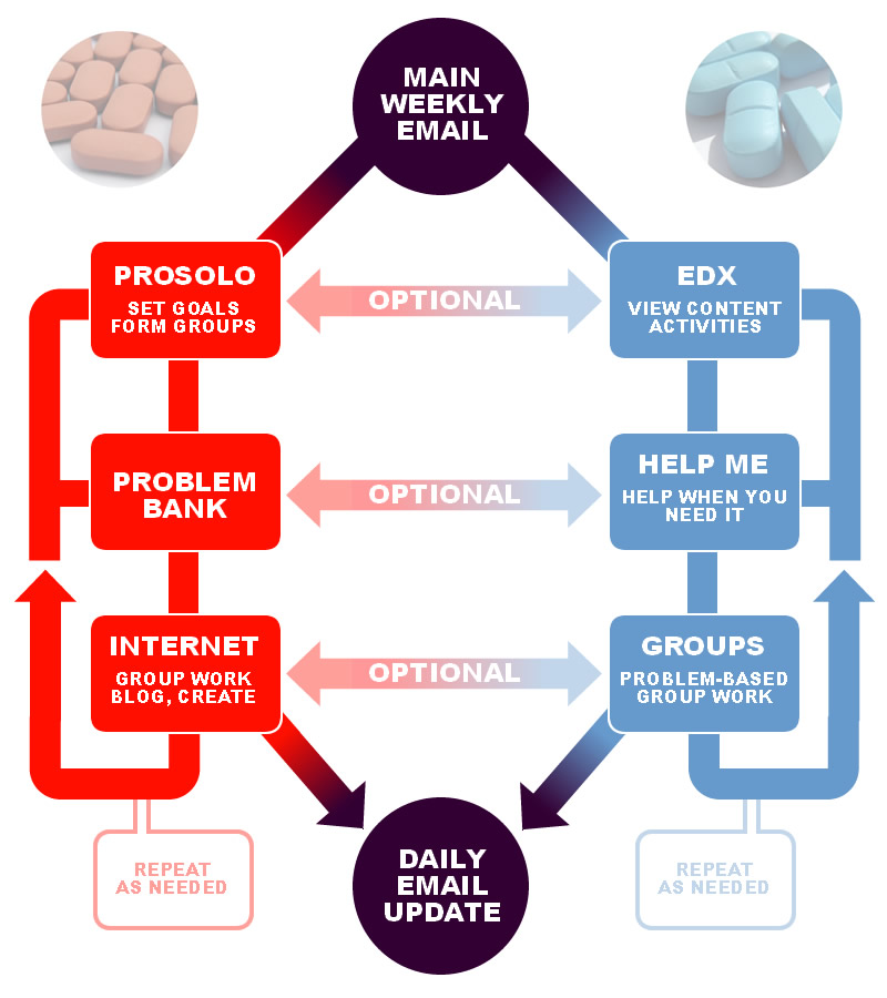
So to continue the examination of the multiple pathways MOOC (aka “dual-layer”), I want to pull back a minute and look at the overall flow of the course from a different (but familiar) perspective.

One of the ways I think we are falling flat in MOOCs (and to be honest, all forms of courses) is in the process of introducing the course and maintaining an overall vision. A colleague of mine often says “without vision, the people perish!” What this basically means if that people don’t have a good reason to get pumped up about what they are doing, they give up. Another way of looking at this is: “[insert your topic here]: So What?!?!”

Introductory sections and goals are good components to have, but they aren’t enough to bring vision to all learners (some will be self-motivated, of course). In traditional courses, the “So what?” can easily be answered with “I paid for it, its required, it helps my degree plan, so good enough!” While that is not the best vision, it usually fills the gap. So a bit of problem there, but with a stop gap. But in open classes? People need a better answer to “so what?” than that (because they can drop out with no loss) or even any answer, period.

And not because they aren’t necessarily interested or motivated. They just need some fuel to keep their self-motivation fires burning when the pressures of life press in to the time needed for self-selected course.

This is the beginning of the process of Heutagogy, which will continue into the next issue to examine.

One of the major criticisms of some college programs is that they are focusing too much on content and not enough on marketable skills. In any technology-related field, this causes problems when that content goes obsolete. For example, computer programming degrees may teach, say, “Intro to PHP” and “Advanced PHP” in the sophomore year – typically with a textbook that is already a few years old. However, three years later when those students graduate, that PHP has gone thorough several new versions, while many companies have moved on to Ruby on Rails. So the learners panic because they realize “I need a class on the new version of PHP and Ruby on Rails! But I am out of college!”

What this does is create a reliance on the instructor as knowledge dispenser and the class as “specific skill set trainer.” What is missing is teaching learners how to learn (aka heutagogy) instead of how to consume content from an expert (instructivism).

At the very beginning, computer programming college degrees should focus on teaching students how to figure out any programming language. Just look at basic concepts, theories, and then several method out there. Because different learners will be, well, different – they will need to figure out if they need Dummies books or online tutorials or to work alone or to follow an expert or whatever it means. Once they have their own process down, the rest of the program should focus on honing these self-directed learning skills by letting learners loose on whatever the language de jour is. But the classes should not be called “Advanced Java” or what ever it may be, but “Solving Advanced Problems Using New Languages” or something like that. Since changing course titles and textbooks is very difficult to accomplish quickly, just make the titlesmore open from the beginning to allow for students to pursue more up-to-date and/or relevant content. Or just go all crazy and allow for more advanced open learning.

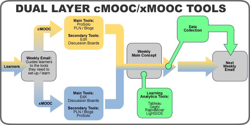
Pulling this altogether, I would look at a theoretical flow of content like this (based on data analytics, the current topic of a the multiple pathways MOOC):

1) Give learners vision (and let the vision frame the rest of the class). Have all instructors answer the “Data Analytics: So What?” in a short video of a few minutes. And then I would say just slam the learners into group work. Have all learners answer this question before class even starts:

If someone came up to you on the streets and said “Data Analytics: So What?”, my answer would be:
a) adequate to inspiring
b) some what uncertain to non-existent

Then place all learners into groups of five with about 1-2 A’s and 304 B’s. Let those who are already a bit advanced envision the others.

2) Go through the introduction, but the first major topic should be how to identify and follow the major thought leaders and organization in Data Analytics. Once learners connect with these leaders, they have taken their first step to becoming lifelong learners about Data Analytics rather than short-term consumers of expert knowledge that need to keep coming back to the same expert fountains in order to learn and grow. We often leave this step to the end or scatter it as optional content throughout the material, but I think in today’s society this is not adequate. Start off with learning how to find the updated thought on data analytics and let learners begin to find the new ideas and products from the very beginning of class.

3) Dive into the intro material, but expand it to include teaching the basics of how to do Data Analytics in all situations, scenarios, software environments, etc. Teach learners to know how to learn for themselves what to do, not just follow the steps you provide. In data analytics, that would teach them how to analyze the data in general in any program: extracting data, visualizations, network analysis, regressors, etc. Teach them the basics of how to figure out any data analytics tool they come across.

4) Then dive into real life scenarios, problem-based learning, even student centered learning. I know that at times there will be certain functions that only one program does, so I’m not saying avoid any specific instructions. But think of it this way: portions of the specific instructions you teach your learners will be obsolete when the next version that is released. In other cases, many learners will be at an institution that requires one type of software. If you only taught them to figure out the narrative of data using Tableau, and their institution wants them to use Gephi, they may get stuck. But if they learn in general how to look at the narrative of data and then are allowed to choose the tool they use to accomplish this analysis, they might find the course much more meaningful to them as learners.

Of course, I am oversimplifying this idea and real courses will be a mixture of looking at specific functions that only exist in specific places and alongside overarching ideas that can transcend applications. The overall point I am getting at is to focus your design on teaching your learners how to learn about your topic, with the specific tools and processes as examples and case studies rather than the overall focus itself.

As for how to arrange the tools themselves, I want to look at that idea in more detail in a separate post where we will go on a treasure hunt with Nicholas Cage.

Is There a Difference Between xMOOCs and cMOOCs?

Recently I have been reading a few different thoughts on the difference between cMOOCs and xMOOCs. Or more specfically, how there is no real difference between the two and the classifications do more harm to the conversation than help. I would respectfully disagree – the differences are real, and they do matter. To ignore the differences would cause more damage in my opinion.

Of course, this has been explained in much better terms by others before – but this is just my attempt to try a different framing mechanism.

A lot of the discussion centers around how there are social activities in xMOOCs as well as guided content in cMOOCs. To me, that’s a non-issue. Social elements do not define cMOOCs, and lack of social elements does not make an xMOOC. Instructor-led content does not define an xMOOC, and lack of content does not define a cMOOC. That is like saying that pizzas and burgers are the same because they both have salt and can be ordered at a fast food restaurant. Sharing some similar characterisitcs does not mean that the ones that they don’t share are not important.

I’m working on a content analysis research project that is looking at what themes would emerge if you analyzed the content of the syllabuses of 30 MOOC courses. The differences between cMOOCs and xMOOCs are quite noticeable. Everyone has sightly different terms for the concept of power, but whether it is “who holds the power” or “who has autonomy” or if “autonomy is a classification of power”, the seat of power is the real difference between xMOOCs and cMOOCs. Whether you look at is as active learning versus passive learning, or instructivism versus connectivism, or constructivism versus behaviourism, or student-centered versus instructor-centered, the basic question is “who is in the driver’s seat for the learning of each individual learner?”

If the content is laid out for the learner (or “curated” by the instructor) and the learner must go through a certain set of modules and take certain tests and discuss certain topics and so on, the instructor (via course design) is in control of the steering wheel for each learner. They may discuss and form groups and all kinds of social things. They may form PLNs and use Twitter. That does not make the course connectivist. I have been in some courses that had no content but the social groups were so controlled that we had no input on the whole class. If a course is designed on a passive, instructivist, behaviourist, instructor-centered manner, it is still an xMOOC no matter how much social stuff is tacked on.

On the flip side, if each learner is in the driver’s seat for their learning, and you are creating a course that is active, connectivist, contsructivist, student-centered, etc – that is the heart of a cMOOC. You can create weeks worth of content and put it in there, but as long as it is optional for students that want to use it as they see fit, it is still a cMOOC.

So what that means is that courses like EDCMOOC that claim to be neither xMOOC nor cMOOC are actually xMOOCs that just don’t know it. Nothing wrong with being an xMOOC. But why is it an xMOOC? Because the content is “teacher-curated and -annotated selection of resources on weekly themes, including short films, open-access academic papers, media reports, and video resources” that “were the foundation for weekly activities, including discussion in the Coursera forums, blogging, tweeting, an image competition, commenting on digital artifacts created by EDCMOOC teaching assistants, and two Google Hangouts” according to the paper on the course.

The instructors were still in the drivers seat. Sure, they let students form their own groups. They let the students form networks. But they were still in the seat of power.

And to be honest, I don’t have a problem with that happening. Many learners (for better or worse) still want the instructor to be in the driver’s seat. But what about the students that wanted one thing and got another? Confusions in power structure in courses can lead to frustration among learners. They may still end up happy with the course but be confused about what happened along the way. The EDCMOOC article authors pointed out that “For every person who hated the peer assessment, someone else loved it.” Why is that? Were they expecting one thing and got another? Were they confused as to why they read all this curated content and then had another student assess their work? Learners that have to find their own content tend to feel more comfortable with peers assessing their work, but those that have to read curated content (technically, all content added in any course ever was curated) as the foundation for the activities will usually want the instructor to assess their work, since it was the instructor that first told them to consume that content.

Of course, classifications in education are not about black & white, either/or boxes. Classifications like “xMOOC/cMOOC” are really more of generalized categories that kind of coalesce around certain characteristics. But most people know that they are not hard, fast lines. One problem that is emerging in education is misunderstanding what educational classifications are and what they aren’t. MOOC designs that mix elements of xMOOCs and cMOOCs are not a sign that the classifications are wrong. They are a sign that we need to understand the underlying differences even more or we could continue to confuse and polarize the issue even further. More and more learners are discovering the difference between instructivism and connectivism (even if they don’t know those words), and are wanting to learn in their preferred paradigm.

Bridging Learners From Instructivism to Connectivism

One of the more interesting challenges of the Dual Layer MOOC project (at least from a design standpoint) is the learner autonomy goal. The instructors don’t want to force learners to be open (or closed, for that matter). If learners want to be completely guided by the instructor (instructivsm), then there will be that option. If learners want to use completely networked learning (connectivism), then there is that option. Designing two layers based on those two ideas is fairly straight forward (as long as you do it well). If learners that are on the networked learning path want to dip into the guided path, that usually is not a problem, because that has always been part of being an autonomous, self-directed, networked learner: find some content and consume it as needed and then go back to your network. However, for those on the guided path that want to transition into networked learning, the path is not as easy. Many may not even try it because they are used to being guided. You can blame the system or learners not wanting to take risks or many other factors and be correct, but the reality is that transitioning from guided objectives to self-directed competencies is a barrier for many learners. One possible solution is to scaffold the learner from instructivism to connectivism. This would go back to the deconstructing objectives idea I touched on earlier, but in this case you could guide learners through it. Remember, this is for the learners who are used to being guided, so you would have to also guide them through the process of learning how to learn (or heutagogy as some call it). Starting with a basic instructivist guided objective with conditions, behaviors, and criteria, you might have something like:

Given the EdX module resources (CN), the learner will analyze ethics in data analytics (B) by scoring at least 90% on the module quiz (CR).

But since that is what they are used to, you could stretch them a little bit by removing the criteria to get them to start thinking for themselves a bit:

Given the EdX module resources (CN), the learner will analyze ethics in data analytics (B) by __________________ (CR).

Learners would have to fill in the blank for themselves. What you have here is the beginnings of the idea behind the ds106 assignment bank, although not quite there yet. Once the learner has gotten this down a bit, you could then take it a step further by removing the condition:

Given _______________________ (CN), the learner will analyze ethics in data analytics (B) by __________________ (CR).

This is a lot closer to the ds106 assignment bank. And then you could even strip everything away from the behavior except the topic and move that to the condition:

Given the topic of ethics in data analytics (CN), the learner will ______________________ (B) by __________________ (CR).

At this point, learners are practically writing their own competencies – they just need to make sure to create something applicable to their situation and they are there. Along with this, you might want to also scaffold them into group work. For example, with the first level of scaffold you might tell them to goto the group discussion board and get feedback on the criteria they are creating. Then on the next level, they could get in groups and swap their personal objectives with others to see if others can accomplish them. Finally, they are placed in groups with other that have similar objectives to find a common goal to work on. Hopefully they can then start working as an autonomous learner within a connectivist environment for the final step. However, there is the big issue of not forcing learners to take this path if they are not ready. There would be great value in creating a course that specifically teaches learners to move from instructivism to connectivism, but that would still be basically one path through the content. Even adding that path to the dual layer MOOC would essentially make it a single pathway course if it was forced on all at a certain point. But learners that are used to instructivism need that path – that guidance – to start the process of stepping out. So the tricky part of the course design would be to create a system that allows learners to stick with the course layer they like, but also switch over as they like (and by default have a pathway for guided instructivist learners to switch over at any point they are ready). One possible solution is to lay out all possible steps each week in the weekly blast or announcement or blog post or whatever it may be. It could look something like this:

Welcome to Week 3 of Data Analytics! The topic for this week will be ethics in data analytics. For those of you in the networked path, you know what to do. Or maybe you don’t yet, but go to your groups and get working. Write your own competencies and get working with others on one of the weekly problems in the Problem Depot. Or create your own problem. Those of you that need a new group to join, go to the Random Group-o-Mizer and select “new networked group”. For those of you on the guided path, your content is in the EdX course. For this week:

  • Given the EdX week 3 resources, you will analyze ethics in data analytics by scoring at least 90% on the module quiz.

For those of you on the guided path that are ready to dip your toe into the networked path, this is your challenge:

  • Given the EdX week 3 resources, you will analyze ethics in data analytics by ____________________ (?)
  • Create your own criteria for determining that you know the content (i.e. fill in the blank above).
  • Go to the Random Group-o-Mizer and select “dipping my toes in”.
  • Share your personalized objective with the group you are assigned to and give feedback on the other group member’s criteria.

For those of you that have dipped your toe in and are ready to go deeper down the rabbit hole, this is your new challenge:

  • Given ________________ (?), you will analyze ethics in data analytics by ____________________ (?)
  • After creating your own criteria (first blank), go find some kind of resources to help you learn what you need to (second blank).
  • Go to the random Random Group-o-Mizer and select “Going deeper down the rabbit hole”
  • In your assigned group, switch your personalized objective with others and see if you can accomplish each other’s objectives.

For those that have taken more control and are almost ready to dive fully in to networked path, this is your final challenge:

  • Given the topic of ethics in data analytics, you will ______________________ (?)  by __________________ (?).
  • Figure out what you are going to do with the topic, how you are going to do that (first blank), and how you are going to prove you did it (second blank).
  • If you apply this objective to some situation in your life, you be pretty much writing your own competencies like a pro.
  • Go to to the Random Group-o-Mizer and select “My path to being a Jedi is almost complete”
  • This should match you up with a small group of people with similar competencies. Your goal as a group is to work together to solve one of the problems in the Problem Depot based on shared competencies.

If you think you are good with the final challenge and want to go through with the full transformation to networked learning, go back to the first part of this daily blast and jump in to the networked learning path.

Of course, there would need to be more guides in there for some of these steps, but hopefully this gives you an idea. The “Random Group-o-Mizer” would basically just be some profile system that allows learners to put in some basic interests, select a level of participation, input their objectives or competencies, and then be grouped according to some algorithms that puts them together by shared objectives/competencies. The “Problem Depot” is basically an assignment bank that is re-purposed for problem-based learning. Learners could even create their own problems and submit to this depot. The basic idea is that every week we give learners the steps to scaffold to connectivism and let them go at their own pace through the transformation. Of course, it won’t be this straight forward or easy in real life, but the struggle is part of connectivism, right?