DALMOOC Design and Scaffolding

Returning again to the design of DALMOOC and more specifically the visual syllabus, I wanted to take a look at the scaffolding decisions that were made. In some ways, this course was a unique challenge because we had to do some true scaffolding that could possible span several different levels of experience, from complete newbie to seasoned expert. This is different than most instances of scaffolding, because typically college curses are really more along the lines of linear constructivism than scaffolding. What I mean is this: for most courses on the college level, you assume that your learners have a prerequisite level of knowledge from either high school or earlier pre-req courses. You aren’t introducing, say, physics for the first time ever – but instead you are building on the Intro to Physics course in order to help students learn how to build rockets and predict launch patterns. So you don’t scaffold as much as take chunks of knowledge and skills and plug them into (linear constructivism) existing knowledge. This is scaffolding at the basic level, but you may or may not go beyond one level of scaffolding.

With DALMOOC, we knew that learning analytics is still new for many, but old news for some that may just want to learn some different tools. Additionally, we were adding in new technology that we knew for a fact that no one had ever used. Throw in that mix an international crowd that won’t all be speaking English and then even add the idea to create a visual syllabus (which few are familiar with). This is a tall order covering a huge range that most courses don’t have to consider.

So where to start? Well, with the first page of the syllabus. It needed to be visual, with minimal text, but clear where to start. A wall of text that basically says “start here” kind of violates a lot of what it needed to be. But if you look at anything from OLC to Quality Matters, most online course evaluation tools recommend having a clear and simple indication of where to start. What is more simple and easy to understand than a basic “1, 2, 3, etc”? I have traveled to Asia and Europe and Africa and even people who don’t know English still understand enough about our number system to know that a web page with those numbers on them would indicate you start with number 1.

Of course, a small number of people felt that this was still too confusing. I’m not sure what to say to that. You are presented with a page that says “Welcome to the Class” and then some big buttons that are labeled 1, 2, 3, etc. I’m not sure what is simpler than that.

Of course, I realize that there are those that really, really need the text because they have been programmed to look for it their whole lives. The buttons were given a rollover effect that gives a more detailed description of what they are leading to. This serves two purposes. One, it gives detailed descriptions that are there when you need them, but aren’t filling the screen and overwhelming people that are completely new. Two, they make you actually do something with the syllabus instead of just passively reading a wall of text. You have to mouse over or click on various items to get more details. This moves you from passive to (slightly) active. This was on purpose to get learners engaging more with the content on the very first page. Additionally, this idea was continued on the other various visuals.

For those that are not new to all of this, links were provided on the upper right hand corner – where they usually are on most websites. We don’t expect people to follow the path laid out for them. In fact, we encouraged learners to skip around and make their own path as needed. And that was also possible from the design.

As expected, there was some push back from a few learners (about 5-10 out of the 6,000 that were active at some point) on the design. The basic feedback was that they didn’t like the roll over effects. They wanted the text to be there without rolling over. This probably tells me that the right decision was made, because that was exactly what the rollover effects were designed to do: make the learner do something instead of passively absorbing text. Of course, there are other ways to accomplish the same goal, so other ideas might be used in the future.

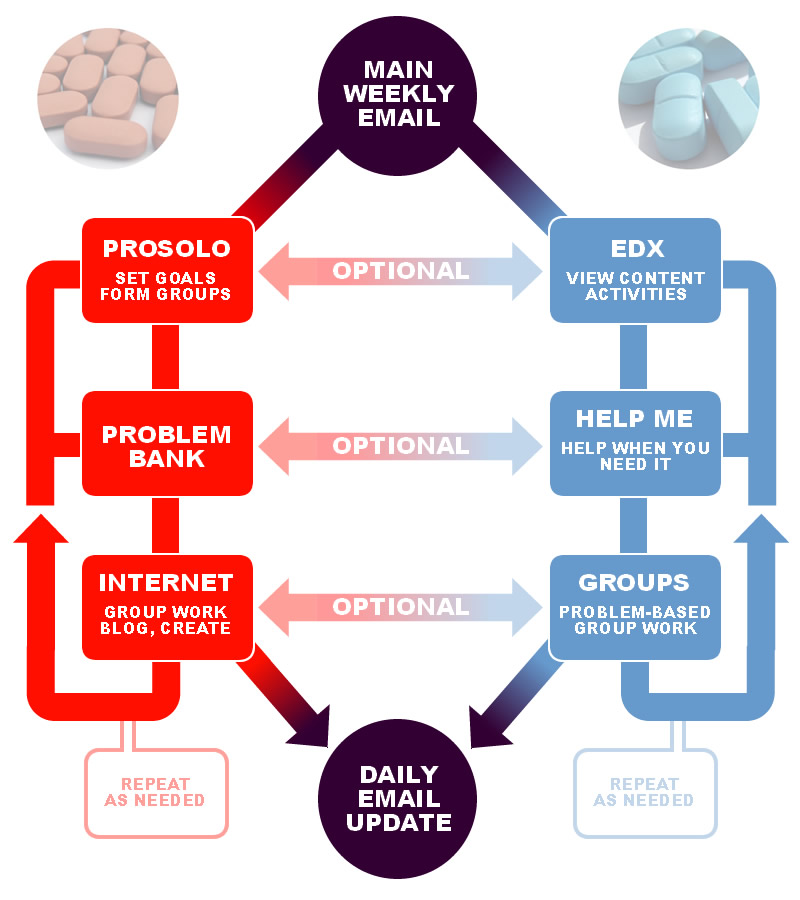
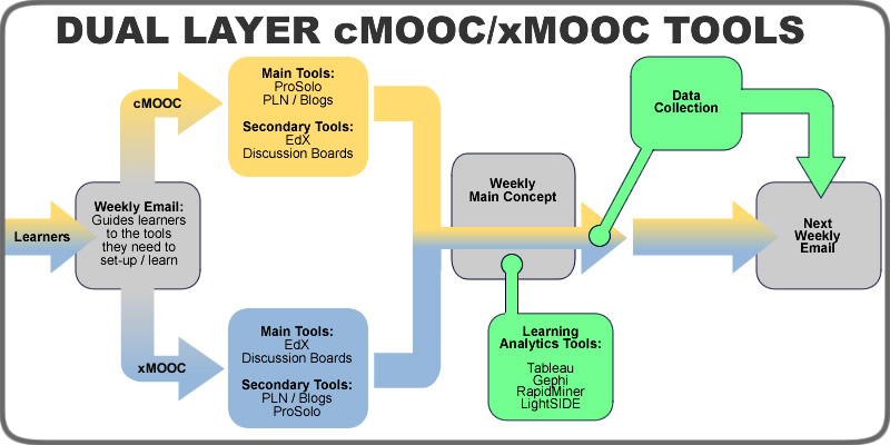
The biggest challenge in describing the structure was how to explain the nature of the dual layer course. Course themes are always helpful, as the many versions of ds106 have proven. Of course, it would have been nice to have enough time to have carried out the theme for the whole class. Many of the problems with understanding the structure can probably be traced to the fact that we were not able to inject this theme throughout the entire course (of course, those problems could also come from the fact that we initially designed the daily email to be the central anchor for the course (and therefore, the place were scaffolding and structure sense-making would happen)). It seems like that aspect fell short. However, I think that a consistent theme that is carried throughout the course as a true sensemaking/guidance tool would alleviate many of these issues. Of course, scaffolding in general is a problematic concept in this dual layer approach, but that will have to be a topic for another blog post.

The theme itself was chosen early as an initial idea that ended up sticking. I think the Matrix “blue pill/red pill” theme was a good place to start, but gets a little murky once people start mixing the two and bringing in their own ideas (which is, of course, what we want). My first idea was actually a table full of play-dough – all kinds of colors just waiting for learners to pick and choose and make into whatever they like. Ultimately, this leaned too much towards my connectivism bias and was probably too unstructured for new learners who wanted instructivism. I think that a mixture of the two ideas might work as a better theme in the future: learners are initially given the choice of blue or red play-dough, but they can choose one or the other or mix together to make their own shade of purple – or bring in their own colors to create what they want.

Of course, some of the more complex ideas that were thrown around earlier, like creating scaffolding out of objectives or dynamic group formation and changing, never made it into the course. Interestingly enough, some learners (around 10-15) asked for various versions of these ideas, so they may bear exploration in the future.

Underlying these design decisions were some different theoretical perspectives that go beyond Connectivism and Instructivism (LTCA Theory, Heutagogy, Metamodernism, etc) that will need to be explored in a future blog post.

Ed Tech Retro-Futurism

Every time I read someone’s tag line or bio that self-describes themselves as an “ed tech futurist”, I chuckle a little inside. Since time only seems to move forward (as far as we can tell), aren’t we all a little bit of a futurist inside? I mean, besides thinking about what we will eat next or if we will be at the same job next year, don’t we all pay some attention to the future of technology? Whether its the next phone we want or what we want to our apps do in the future, I think we all have a futurist in us. Might as well say “I’m an oxygen-breathing human.”

Maybe its a way to say that you are trying to shape the future, or predict the future, or something along those lines. But wouldn’t that make you more of an ed tech fortune teller?

Maybe it’s just me, but every time I read about the future of ed tech, I seem to just see a newer, fancier way of getting dogs to drool when a bell rings. And I admit, I’ll be the first dog in line to drool over the Occulus Rift or anything else, but has anyone else noticed that all of the coolest tech toys are really just finding more and more realistic ways to recreate this thing we already have called “reality”? Can we just be honest about Occulus Rift and call it “Your Own Eyes 2.0”, or call 3-D printing “Stuff 2.0”?

In many ways, we haven’t as much come up with new ways to teach as much as new toys to make Pavolov’s dog happy. Its like we want to completely ignore the Clark/Kozma debate and say “Google Education will revolutionize education more than MOOCs ever did!” or something along those lines.

That’s why I tend to focus on ideas and philosophy more than gadgets and websites these days. We still haven’t gotten to a point that we are implementing some of the last truly new ideas we had from Skinner to Vygotsky to even people like Foucault and Habermas in education in transformative ways…. even though we know that they often work better than behaviorism does in many instances. No wonder we are still resistant to ideas like connectivism and heutagogy – we never got past cognitivism and pedagogy.

So, yeah – I still look more towards the ideas of the past as holding the best promise for the future, because while people are right that there really isn’t anything new per se about connectivism or heutagogy, it is an idea that takes what we’ve known really does work from the past and marries it to the way the world is today. These retro-futurist ideas give us an idea of where we need to head in the future of education by being grounded in the ideas that we never really got at any one point as a field as a whole (notable exceptions withstanding, of course).

Some would say “well, why don’t we just bring back social constructivism?” Well, for one it didn’t catch on the first time around, and two, the world has changed some since then. So we need to take the parts that worked and mix them with a healthy dose of reality. Don’t like connectivism? Well,then come up with your own idea. I would bet you will mix together a lot of the same source ideas of chaos and networked learning and so on and so forth and come to a crossroads of going idealistic (which is where the proponents of social constructivism messed up in the past), or realistic. An idealistic route is one that says “we need a lot of money and small classroom sizes and large numbers of well-trained teachers to pull this off!” While it is true that this will work, it would also work for behaviorism just as well. And guess what? Your never going to get that. So if you go the practical route of scaling learning with less resources and less money and less instructors and what do you get? Open learning, connectivism, heutagogy, etc.

All roads in education are leading to the same place no matter how much new technology we throw at them. But sometimes it seems like the new technology is actually slowing down the real progress as we focus more and more on how to get the puppies to drool faster and faster with fewer and fewer bell ringings. Maybe someday when we actually gain the ability to download factoids straight to the human brain via the Matrix, we will finally wake up and say “oh, I think we finally have this one corner of the educational experience down. What else is out there?”

Who MOOCed My Cheese?

Conversations behind the scenes with the DALMOOC have turned to looking at the kind of feedback we have been getting on the course. George Siemens shared some of the things that he learned the first week. His post also deals with some of the feedback we have received.

The hard part with dealing with feedback is that most of us end up with a skewed view of it after a while. Positive feedback is usually pretty general and therefore easy to forget because its not very specific. Everything from “this looks great!” to “I am loving this!” to “I really like what you are doing here” serves as great feedback, but because of the general nature and lack of specifics tend to be easily forgotten. Negative feedback tends to be specific and direct. This makes it a lot easier to remember. People will tell you exactly what they don’t like and a dozen reasons why they don’t like it.

Because of this skew, the negative feedback tends to stick in our mind more easily and we also tend to get the impression that there is more negative than positive. This becomes a problem when we begin to make design decisions based on gut feelings rather than hard numbers. If you count up the positive and negative feedback, which one is higher? If you take a qualitative look at what was said, is there anything helpful either way? Saying “I love this” really just indicates a personal preference more than an actual analysis that a designer should take into consideration. In the same way, “I don’t like this” is also really just a personal preference that really doesn’t tell us much about design. Learning is not all puppy dogs and fairy tales – sometimes you have to create situations where learners have to choose to stretch and grow in order to learn. There is nothing wrong with some struggle in learning. Often, complaints about learners not liking something are actually good indicators that your design is successful.

If you disagree, that is fine. But don’t design anything that involves group work. A lot of people hate group work and if you create a lesson that requires group work, you have just acknowledged that sometimes you have to struggle through group dynamics in order to learn whether you like it or not :)

But sometimes when someone says “I don’t know what to do with this tool!” what they are really saying is “I am not sure what to do and I don’t want to try because in the past there have been huge penalties for trying and getting it wrong on the first try!” This is a sad indication of our educational systems in general. We don’t make it okay to experiment, fail, and learn from failure.  The reason so many people demand more tutorials, more hand-holding, more guidance is not because they afraid of chaos as much as they are afraid that they will get their hand slapped for not getting it right the first time. This is likely due to it almost always happening in the past.

So in something like DALMOOC, where you are free to get in and experiment and fail as much as you want to, most of us have been conditioned to panic in that kind of scenario. That’s what our excessive focus on instructivism does to us as a society. People are afraid to play around and possibly fail for a while. They want to know the one right way to do something, with 10 easy steps for doing it right the first time.

So, in a lot of ways, much of the feedback we are getting is along the lines of “who moved my cheese?” And that was expected. We are trying to jump in and explain things to those who are confused as much as possible. We are hoping that those who are bringing up personal preferences as negatives will see that we had to design for the widest range of learners. Or maybe to see that if they still figured something out, that this thing actually worked as designed (because its not always about personal preferences as much as learning).

But, to be quite honest, an objective examination of all feedback would seem to indicate that most of it is positive. Many of you like the challenges and the struggles. That is great – you get it. Most of the positive and negative feedback is along the lines of personal preferences – you don’t like rollover effects, you love Bazaar, this optional assignment is too hard, this required one is too easy. I’ll continue blogging on design decisions to clarify why they were made – not to justify them as right (instructional design is rarely about black and white, right and wrong decisions anyways), but to explain why they were made. And there are some genuine complaints about confusion that we are addressing.

Just as us instructors and designers can develop a negative skew, so can the learners. They can see a few specific negative tweets in a sea of general positive tweets and start to think “wow – maybe I should be having more problems?” Don’t worry – most people are doing just fine. Problems, praises, issues, suggestions, and complaints are welcome, but just remember they don’t necessarily apply to you as a learner. You are free to love or hate any part of the course you wish. You are also free to pick and choose the parts of the course you participate in, so don’t waste time with something that isn’t working for you. But also be careful not to label something as “not working for you” just because you don’t like it or are struggling with it. Sometimes the struggle is the exact thing that you need in order to learn.

MOOCs and Codes of Conduct

Even before the whole GamerGate thing blew up, I had been considering adding a Code of Conduct to the DALMOOC. UTA has always required an Honor Code in all course syllabuses, so to me this issue was a no-brainer (even though we aren’t treating DALMOOC as a specific UTA-only course). But I know others don’t see the need for Codes in general, so I wanted to dig more into the reasoning behind a Code of Conduct for online courses – especially MOOCs.

I know some feel that you can’t really stop bad people with just a statement, and that usually the community will rise up to get rid of the abusers and trolls anyways. Sometimes both of those are true. But not always.

I have been a part of Facebook groups that did not have a code and ended up leaving. You would think the group would have risen up to stop people from being abusive, but that was not the case. And when I spoke up? Well, it quickly became time to leave. I have also been in some groups that did have a code in them and witnessed first hand seeing someone asked to comply with the code and – believe it or not – they stopped, apologized, and changed. It does work sometimes.

But other times it doesn’t. So you can’t just say “be cool to everyone” and leave it at that. There has to be a threat of consequences from the people in charge for the Code to have teeth. The problem with using the UTA Honor Code in a MOOC was that it was designed for a small group of people in a closed system where you can ultimately with one click boot out people that don’t comply. And then send the police after them if they don’t get the message. Open online courses, though? A lot trickier to enforce.

So, I turned to the work of Ashe Dryden and her recommendations for conference codes of conduct. Since conferences are a bit more open than closed online courses, I thought that would be a good place to start. I also decided to add links to the privacy statements of all services we recommend, as well as links to reporting abuse on those services. I felt people needed to be aware of these issues, as well as know what one place to go to access the, all. If I should add anything else, please let me know.

So you might wonder why the language is so specific on the Code. Just tell people to be cool or else your out, right? The problem is that this is too vague. Some people can be very abusive in a way that flies under the radar of most gatekeepers, because they are looking for obvious hateful words and actions. True abusers have found ways to go under the radar. So we need to be as specific as possible in these codes as a way to empower our learning communities to know what to look for in the first place. You can’t just expect the community to rise up and fight abusers – you have to give them the tools and words to use in order to fight. And one of those tools needs to be an appeal to authority. You see, its one thing to say “I think you are being abusive, stop” and another to say “the rules say this: _____.” Trust me from experience: abusers rarely care when you come in and say “stop treating this person that way because I think you are wrong.” If we want our communities to rise up and stop abuse, we have to empower them with the tools and words they need from us as the leaders. Yes, they are able to come up with their own words; however, it is much more powerful when their words match ours instead of fill in our blanks.

And I know what many say: “this will never happen – I have never seen abuse happening in classes.” I hope that is true. But I would encourage you to look into recent cyber bullying research. Many people that experience abuse do not speak up because they feel no one will listen. So is the fact that you have never heard of abuse online a sign that there is none, or that no one thinks you are a safe person to discuss the issues with? An important difference there.

Think of it this way. The DALMOOC has over 18,000 people signed up last I heard. That is more people than thousands of small towns in America. Thousands of towns that also have a crime rate and an abuse rate. If even small towns can’t escape from attracting criminals and abusers, how sure are we that our MOOCs will?

And oh yeah: #stopgamergate. Call me a SJW or whatever you want. I wear it proudly.

Social Learning, Blending xMOOCs & cMOOCs, and Dual Layer MOOCs

For those who missed it, the Data, Analytics, and Learning MOOC (DALMOOC) kicked off orientation this week with two hang-outs – one as a course introduction and one as a discussion over course design. Also, the visual syllabus, the precursor of which you saw here in various blog posts, is now live. The main course kicks off on Monday – so brace yourselves for impact!

The orientation sessions generated some great discussion, as well as raised a few questions that I want to dive into here. The first question is one that came about from my initial blog posts (but continued into the orientation discussion), the second is related to the visual syllabus, and the third is in relation to the Hangout orientation sessions themselves:

  • Don’t most MOOCs blend elements of xMOOCs and cMOOCs together? The xMOOC/cMOOC distinction is too simple and DALMOOC is not really doing anything different.
  • Are the colors on the Tool flow chart mixed up? Blue is supposed to represent traditional instructivist instruction, but there are social tools in blue.
  • Isn’t it ironic to have a Google Hangout to discuss an interactive social learning course but not allow questions or interaction?

All great points, and I hope to explain a bit more behind the course design mindset that influenced these issues.

The first question goes back to the current debate over whether there are really any differences between xMOOCs or cMOOCs or whether this is a false binary (or not). I have blogged about that before, and continued by pointing out that the xMOOC/cMOOC distinction is not really about “binary” at all as much as where certain factors cluster (more specifically, power). I submitted a paper to AREA this year (that I hope gets accepted) with my major professor Dr. Lin that was basically a content analysis of the syllabuses from 30 MOOCs. I noticed that there were clusters of factors around xMOOCs and xMOOCs that didn’t really cluster in other ways. I am now working on some other studies that look at power issues and student factors like motivation and satisfaction. It seems like not matter what factor I look at, there still appears to be clusters around two basic concepts – xMOOCs and cMOOCs. But we will see if the research ends up supporting that.

So from my viewpoint (and I have no problem if you disagree – we still need research here), there are no hard fast lines between xMOOCs and cMOOCs. The real distinction between the xMOOCs and cMOOCs is where various forms of power (expert, institutional, oneself, etc) reside. For example, was any particular course designed around the students as source of expert power, or the instructor? You can have content in a course that has the student at the center. You can also have social tools in a course that sets the instructor as the center.

Our guiding principle with the DALMOOC was that there is nothing wrong with either instructivism / instructor-centered or connectivism / student-centered as long as the learner has the ability to choose which one they desire at any given moment.

That is also the key difference between our goal with course design and how most other blended xMOOC/cMOOCs are designed. Most blended MOOCs (bMOOCs? Sounds like something from the 80s) usually still have one option / one strand for learning. The content and the social aspects are part of the same strand that all learners are required to go through. Remember, just adding social elements to a course does not make it a social learning, student-centered, connectivist course (especially if you add 20 rules for the forum, 10 rules for blog entries, and then don’t allow other avenues beyond that). In the same manner, just adding some content or videos or one-way Hangout sessions does not make a cMOOC an instructor-centered, instructivist course.

Our design goal was to provide two distinct, separate layers that allow the learner to choose either one or the other, or both for the whole class, or mix the two in any manner they want. But the choice is up to the learner.

And to be clear, I don’t think there is anything wrong with blendedMOOCs. Some are brilliantly designed. Our goal with DALMOOC was just different from the blended approach.

So this goal led to the creation of a visual syllabus to help myself and others visualize how the course works. One comment that arose is that the colors on the tool flow page (explained here) are mixed up: the Quick Helper and Bazaar tools (explained here by George Siemens) are in blue and should be in red. I get that concern, but I think it goes back to my view of the distinction between xMOOCs and cMOOCs. The red color is not “social only” and the blue color is not “content only,” as some would classify the difference between cMOOCs and xMOOCs. The colors are about where the expert power lies. Quick Helper might have social aspects to it, but the main goal is to basically crowd-source course help when learners are trying to understand content or activities. And it is a really cool tool – I love both Quick Helper and Bazaar (and ProSolo, but the orientation Hangout for that one is coming up). But the focus of Quick Helper is to help learners understand the content and instructor-focused activities (again, nothing wrong with that since the choice is up to the learner to give that expert power to the instructor). In the same way, the Bazaar tool is social, but has a set of prompts that are written by the instructor for learners to follow.

I hope that clears that up a bit – the colors indicate where the expert power resides in the design – neither of which are bad in our design. Of course, you as the learner might use these tools differently than that and we are okay with that, too.

The third question is about the irony of using a Google Hangout to explain a student-centered course and then not allow any interaction. I kind of snickered at that one because I usually say the same thing at conference keynotes that talk about interactive learning but then don’t allow for interaction. So it sounds exactly like something I would say. Of course, at keynotes, you usually have the totality of the examination of that topic at that one keynote and then the speaker is gone. A course is different, obviously. But in explaining our reasoning for this issue I would point back to the differences between cMOOCs and xMOOCs and again bring up the point that being student-centered and connectivist does not mean that there are never any times of broadcast from the instructor. A 30 minute Hangout with no interaction fits into a student-centered mindset just fine as long as you don’t see hard fast lines between paradigms.

But I would also point out that the Google Hangout format is too limited for interaction at scale. You are only allowed 10 people in the actual Hang-out. In addition to that, going over 30 minutes gets a bit tedious, and you can’t really do much interaction with learners in 30 minutes even when using the Q&A feature. Not to mention that 30 minute window is set in stone – if a learner misses it because of work or different time zone or whatever: “no interaction for you!” Using a Google Hangout for a global course would be like being the ultimate “Interaction Nazi.” We also noticed a 30-60 second lag between live and broadcast, so that also hampers interaction. Howver, the biggest reason was that we were really looking at ProSolo, Twitter, our Facebook Page, and our Google+ Page as the true avenues for interaction with these Hangouts. Those avenues were active before, during, and after the Hangout for people in any time zone. So the interactivity was there during the orientation sessions, and you actually did see us responding to things from the social channels in both Hangouts. This may change in future Hangouts. The instructors may open up the Q&A function of Hangout. We’ll see.

So, if you have questions about DALMOOC content or design, be sure to post them to social avenues. Or comment here about this post. I am behind on comments (and blogging) due to the looming course launch, but I will get caught up :)

Visual Flow of Learner Tools in the Dual Layer MOOC

As we get closer to the launch of the Data, Analytics, and Learning MOOC, one of the ideas we are trying to bring to life is a Visual Syllabus. The instructors expressed concern with the “wall of text” that many learners run smack into when reading a syllabus. That is a very valid concern, so the idea was born to make the syllabus more visual and narrative.

Below is the rough draft of the flow of learner tools that will be used in the course. The idea is that learners will be able to click on each area and get an in-browser pop-up with a brief description of each along with a link to start using the tool. I would love to be able to put together an animated gif of this (time permitting).

dalmooc-tool-flow

Two quick notes: this is for the learner tools, the tools that the learners will use while learning, as compared to the analytics tools they will be learning about (Tableau, RapidMiner, etc). Secondly, the random pill images are connecting a metaphor that I am thinking about weaving throughout the syllabus (based on choosing the red pill or blue pill in The Matrix; except both represent reality, just one learners are used to and the other that they aren’t). Everything here is subject to change, including the dualistic metaphor.

The general idea is that all learners will get a kick off email for the week, setting out the main idea for that week. Learners will then choose to go down the blue path (towards an instructivist path they are accustomed to) or the red path (towards a connectivist path they may not be accustomed to).

Those on the blue path will enter the EdX course content to view videos, read text, perform activities, etc. As they encounter issues or concepts they need help with, there will be in-context help buttons to click on to get customized help (but still cooler than that, I am just being vague because this will be new tech that is still being worked on). They will also be put in groups of 3-5 by a new technology to work on specific problem-based learning activities (again, new tech that will be detailed later, but trust me its cool). Some of the course work will be highlighted in daily email updates. Learners can repeat parts as needed or even cross over to the red path at any point they wish.

Those on the red path will enter ProSolo (embededd in EdX). This is a new suite of technology that basically enables learners to set their own goals, connect with others that have similar goals, and work to create proof that they have met those goals. If you remember many of the calls to create a tool that fosters true Personal Learning Networks, this is basically that tool. ProSolo will be used in this course and is another cool new thing we are trying. More details on that one to be announced soon. The learners will then go to the Problem Bank (or whatever we name our installation of the ds106 Assignment Bank tool) to find and / or submit problem ideas to work on. They would then connect with their PLN (Internet on the diagram) and work on the problems. Then they would submit artifacts back to the bank. Their blogs, tweets, videos, and other various artifacts will be collected for the daily email updates. Learners can repeat parts as needed or even cross over to the blue path at any point they wish.

The learners will repeat, crossover, and work on various activities until the week is over or they are finished and then repeat for the next week.

All of this is just the rough draft. If you are interested in seeing how it all works out, I would recommend at least lurking in the upcoming #dalmooc :)

A Course is A Course, of Course of Course

Recently I have been pondering the term “course” and whether or not it is a good way to describe educational experiences. We seem to be seeing more rumblings about the deconstruction of courses – from people questioning whether MOOCs really should be called courses to the idea of breaking courses down into smaller chunks.

For the record, I really don’t have a problem with the term “course” or it being changed to include concepts like flipped learning, student-centered learning, or any future new concepts. But there are also other obvious times when the concept of “course” is too broad or too limiting.

I think the part that I am growing uncomfortable with is applying the term “course” to everything regardless of design or intent. Courses are most often attached to an official learning process where an expert confirms that the learner understands, demonstrates, knows, etc. a certain set of knowledge or skills or both. This confirmation could be college credit or a certificate of completion or any other form of “certification.”

Calling that confirmation a course even if the process changes to active learning or semi-connectivism or competency based learning or whatever is fine. But even in pure instructivist courses, learners still step outside of the course boundaries (sometimes ethically and sometimes unethically) to learn. Even when you plagiarize you learn something, even though the whole thing is unethical.

I’m beginning to look at “courses” as experiences where the design of the learning and the intent of the learner is to earn some type of official second party confirmation that they learned some skill or set of knowledge or both. Learning experiences that go beyond this official arena are something else. Those that seek to create competencies or smaller modules are still really just changing the length or format of the confirmation process.

In other words, I don’t know if “course” can apply as a blanket statement to all learning experiences, or even to the path for all learners within any one given experience. Take DS106 for example. Learners can go through this experience in many paths. However, for some learners, they go through a tract specifically designed to earn college credit with the intention of earning said credit. The intention of the design and the learner is to officially earn confirmation of learning. For those learners, DS106 is a course. For everyone else, it is something else. Basically, a Connected Learning-based Open Experience (the experience is designed to be open, but the learning can be closed if the learner so chooses). I don’t really like using the terms “connected” or “experience” when referring to networked learning, so I will need to ponder this one more.

But as we push into more varied intentions of learning design, such as heutagogy, our terminology may need to expand so that not everything fits in the same box, or so that there are enough boxes to accurately describe everything that is happening, or _____ (who knows what). So while I identify that those that say that the term “course” can describe any learning experience currently, I also identify with those that say the term is limited. Just instead of getting rid of it, maybe focus it and add others?

By the Power of MOOCskull – I Have the Power!

Just two days ago I made a comment about how my most throw-away blog posts seem to spark the most interesting discussions. Which is a pretty cool commentary on the Interwebs if you think about it.

The conversation on my last post turned to the difference between cMOOCs and xMOOCs and some thoughts that I have not considered (with great comments from Maha Bali and Alan Levine). If you had asked me just a year ago if I thought there was much of a difference between cMOOCs and xMOOCs, I would have probably agreed that they pretty much overlap and that there is not much difference. But after getting to work on the Dual-Layer cMOOC/xMOOC project as well as conducting some content analysis research on MOOCs over the summer, I tend to have a different view.

That is not to say that there are not elements of cMOOCs in xMOOCs and vice versa. And I am beginning to believe that there are two distinct sources of power in most courses: learning power and designed power (for lack of better terms – I think there are actual terms for these that I am blanking on). The “designed power” is how the course is created by the instructor and/or instructional designer. This is where I identified a problem in the past where instructors communicate one design and then produce another. The “learning power” is what students do with the “designed power” they are given. They might follow directions as told or go off on their own. Which is nothing new – students have been doing everything from study groups to cheating outside of the design of the course for as long as there have been classes. The nature of the Internet in general and open learning specifically probably increases the number of avenues for this “learning power” as well as lowers the barriers to partaking in it. Which is all great stuff.

But I am also a big believer in communication – or more specifically, accurate communication. Jurgen Habermas would probably be a good reference point. But even closer to home, Dr. Scott Warren has created a learning theory based on Habermas called “Learning and Teaching as Communicative Actions“. The basic idea is that you need to know what you want to communicate and then communicate it in the correct format to maximize learning (with apologies to Dr. Warren for the over-simplification). As an instructional designer, I realized that some of the major problems that occurred in learning design were based around a breakdown in the alignment between the “designed power” and the “learning power”.

Additionally, I think that as a profession, we often over simplify some terms. Student-centered is not “student-only”. Instructivism is not “instructor-only.” So, in that sense, there are no pure xMOOCs, pure cMOOCs, pure student-centered courses, or pure instructivist courses. There never have been, because those terms really don’t mean that. For example, student-centered is just “centered” on the student, not “student-only.” There is still room for instructor guidance in student-centered learning.

I think of it this way. If you are a child of the 80s, you probably got the point of the title of this post. He-Man was a classic “so cheesy its cool” cartoon centered around the all powerful He-Man. He-Man has a team of people around him that help him accomplish his quests, but everything still has to center around He-Man saving the day. Even if he is out of the picture for the whole episode, he will still come back in the last minute and make the whole solution about his power. Sure, there is a lot of cool stuff being accomplished by his companions as they do various social interactive tasks, but the power still resides with He-Man, and he determines when the problem is solved.

After all, it is “He-Man AND the Masters of the Universe” not just “Masters of the Universe.”

(anyone else wonder why Prince Adam was running around with a sword and one day just decided to raise it up and say “By the Power of GraySkulll…”? Yeah, lots of drugs involved in the 80s cartoons… which is why they rule…)

Contrast this with the recent Avengers movie. Captain America was obviously the leader at the end, but he really didn’t have a detailed plan that revolved around himself as much as he just set loose the people around him (that were as powerful or even more powerful than himself) to do what they do best. He had no idea where it would go or if it would actually work, and even by the end of the movie the solution really had no relation to his initial plan. It came together because the power was released to the people around him equally and they came to a solution together.

He still had some directions, but think about how Hawkeye, Thor, Iron Man, and Black Widow changed those directions just a few minutes later as the problem got more complex. Even the Hulk went from smashing stuff to smacking down Loki. Because the Hulk is awesome like that. And you get the sense that this was Captain America’s design all along – release the power to those around him.

So that is a nutshell of why I differentiate between xMOOCs and cMOOCs – not on pure designs but on where the power generally seems to be designed to go.

cMOOCs, Connected Courses, or (Just)MOOCs?

Just when you thought things were getting a bit confusing with xMOOCs, cMOOCs, miniMOOCs, POOCs, etc – it seems we now have various extremes existing within each of these classifications. In the cMOOC world, there are now those that argue there really is little difference between xMOOCs and cMOOCs and we should just call them all MOOCs. On the other end of the spectrum are those that say cMOOCs are so different from xMOOCs that they should be called something different, like “Connected Courses.”

As I blogged about recently, there really is a difference between xMOOCs and cMOOCs, and those that want to combine the two are really missing how they are running an xMOOC with social aspects added. When you still retain control over most of what is going on through curration or guidance or whatever you call it, you have an xMOOC.

Those that want to call cMOOCs something else are on the right track. However, I think the term “Connected Course” sounds cool but ends up being a bit problematic. Technically, it means the courses themselves are connected and not the learners. But also, if you Google “Connected Courses,” you find the term has already been in use for a while in many sectors. It usually seems to refer to courses that are aligned across content areas (that is where I first heard the term as an 8th grade teacher) or to a series of prerequisite courses that have to be taken in a specific order.

Also, as George Siemens as pointed out, whether or not these things are “courses” is also arguable.

But the conversation looks to be interesting, so I will be joining the Connected Courses MOOC to see what conversation arises. I might even try to actually finish a MOOC for the first time :)

(Don’t tell the LINK Lab I admitted that)

Probably the most accurate term for cMOOCs is “Connected Learning Open Events” – but CLOE just seems as problematic as (just)MOOC or cMOOC or Connect Course. Set up your POSSE and round up your PLE to jump into a CLOE. Yeah, that will never catch on.

Symphony or Cacophony? Cracking the Code of Tool Selection in MOOCs

One of the bigger struggles with modern day education is tool selection. There are so many good tools that do such similar things that everyone from instructors to CIOs are trying to figure out the secret formula for how many are too few to offer and how many are too many to manage. Some schools apply the “all your eggs in one basket” approach, forcing everything into one mega tool like Blackboard. Others advocate no restrictions, so that learners will be faced with so many tools that they get lost and confused.

Having all your eggs in one basket is nice from a bottom line perspective, but not very realistic for the world we live in since one instrument virtuoso are less in demand. However, Putting too many options in one course can overwhelm everyone from the instructor to the students to the support staff to, well… everyone with a hand in the game. A balance needs to be struck so that your diverse collection of instruments works together as a symphony but avoids the chaos of cacophony.

As we are looking at the dual layer MOOC design, the number of tools we would like to use is also ballooning. Some have been around for a while, some are newer, others are being tested out in this course. But they all seem to play a vital role, so how do we get the right amount that doesn’t overwhelm the students, but still gives them freedom to use what is most meaningful to them?

We could easily just say that all students will use Tableau, WordPress, and EdX for everything…. but that may not end up being what they will use after the class if over, and therefore end up rather useless to them.

We could also just as easily list a ton of tools and link to tutorials, but that would overwhelm many students and encourage more to drop out.

The solution is probably somewhere in the middle – where we offer enough tools to get everything accomplished in the course (assuring, of course, that we are focusing on teaching how to accomplish certain tasks over just focusing on the software) while helping learners to focus in on the tools they need at that given moment.

This is where Nicolas Cage and National Treasure comes in. Cage’s character is trying to use multiple tools to crack a code to find a treasure, basically. But in one scene there are so many possibilities out there that the clue seemed like useless blabber. Fast forward a few scenes and Cage’s figures out that the pair of older glasses would change what he saw on the piece of paper as he changed lenses:

Glasses1

Learners in the multiple pathways/dual layer MOOC will be changing technology filters as they go through the course to accomplish different tasks. There will be many more “lenses” than in the glasses pictured above, each one helping them see a different aspect of learning analytics. Our mission is to organize and tie the various technology filters together in a seamless fashion.

It would almost be nice if we could embed an UrbanSpoon slot-machine like app into the weekly/daily email communication. Learners select the layer they are in (xMOOC or cMOOC), the analytics tool for the week (Tableau, Gephi, RapidMiner, or LightSIDE), and the activity they are working on and they get a custom set of instructions for the week.

MOOC Spoon

Probably a bit beyond what we have time for, but our design will need to help learners focus on just the tools that they need for the time being.

In a general sense, the weekly flow of tools could look something like this:

dual-mooc-tools

Learners would receive the weekly update which guides them to the tools they need to focus on (even though all tools can be used as secondary if needed). The learners then use these tools to go through the zone of proximal development (ZPD) surrounding the weekly main concept. The learning analytics tools are a part of the support for traversing the ZPD. Data collection tools will collect data to guide the next weekly email, as well as student work to highlight in the same email. These weekly (or maybe even daily) communication pieces are important in keeping students in different pathways aware of everything that is happening across the class, and will hopefully even draw some into trying different pathways.

Of course, this is a simplistic look at the process. Or maybe more of a road map for design. The time consuming part will be in building a unified user experience. I’m a fan of the way ds106 created a handbook for this purpose – kind of a combination how-to and FAQ space complete with quick start guide even. They cracked the code for turning their particularly large set of lenses / tools into a symphony quite nicely, and hopefully we can do the same.

(Note: ProSolo is a toll in development that, for lack of better words, serves as a place to collect various streams of content that learners create in their own space. I have been watching the developments with Known that Jim Groom has blogged about, and I like where they are going with that. ProSolo seems to have some similarities with Known on the hub side of things. I’m not sure whether it will receive input from a POSSE (Publish (on your) Own Site, Syndicate Elsewhere) service.)